 |
| By Nilus Mattive |
I don’t base my investment recommendations on charts. Nor do I consider myself an expert on technical analysis.
For my asset allocations, I mostly consider macro forces — big things like inflation rates, interest rates, the geopolitical climate, debt levels and economic growth.
And when it comes to stocks, I’m far more interested in using fundamental analysis and valuations.
But that doesn’t mean I don’t consider an asset’s price history.
That’s a major piece of the puzzle, along with major levels of support and resistance or previous all-time highs.
As the expression reminds us, some pictures are worth 1,000 words.
So today, I want to show you three updated charts.
These form my entire basis for still believing the stock market is heading for a major drop.
How much could it fall? I’ll tell you right after I show you the third chart.
Market Madness Chart No. 1
The first chart is one I talk about often — total market capitalization of U.S. stocks divided by U.S. gross domestic product.
This is commonly called the Buffett Indicator.
That’s because Warren Buffett has said it’s the single best measure of U.S. stock valuations at any given time.
Here’s what it looks like now …
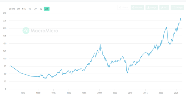
As you can see, we are now in uncharted waters.
At about 236%, the ratio currently sits at twice the 20-year average.
It’s also a full 100 percentage points higher than what we saw during the Dot-Com Bubble.
Put another way, it is more than two standard deviations off the long-term trendline.
The only other time it reached this level was … you guessed it, the Dot-Com Bubble.
Now plenty of people say this isn’t a great measure anymore.
Why? They argue that foreign sales play a big part in corporate earnings, and this metric fails to account for that.
While there’s some validity to that, the truth is that we had a similar percentage of foreign sales back in 2000 to what we do today.
So even if we limit our study to that period, there’s no denying that we are in absolute nosebleed territory.
However, we can also use a different measure …
Market Madness Chart No. 2
Next we have the S&P 500’s price-to-earnings ratio (P/E).
In simple terms, this is the index’s value divided by the earnings produced by its constituents.
Using the basic version, we’d find that the S&P 500’s P/E is around 28.
That’s quite high, but you’ll find times when it has been much higher.
One of the big reasons: Corporate earnings vacillate wildly over the course of a business cycle.
This is why Robert Shiller came up with his cyclically-adjusted price-to-earnings ratio (CAPE).
Instead of dividing the market’s value by a current earnings figure, it aims to smooth out the effect of economic cycles.
It does so by using an average of inflation-adjusted earnings over the past 10 years.
Here’s an up-to-date version of what that looks like for the S&P 500 …
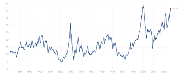
As you can see, investors are paying just about the highest valuations EVER for U.S. stocks right now.
The only time the CAPE ratio has been just a bit higher was back at the top of the Dot-Com Bubble.
That was right around the time Shiller’s book “Irrational Exuberance”was nearing publication … a full four years after Fed Chairman Alan Greenspan first used the same term to address fears that a bubble was forming.
It was also right before I started working for the index provider, Standard & Poor’s.
Which brings me to my third chart of the S&P 500 itself.
Market Madness Chart No. 3
Here’s a monthly version that goes back to the beginning of 2000 …
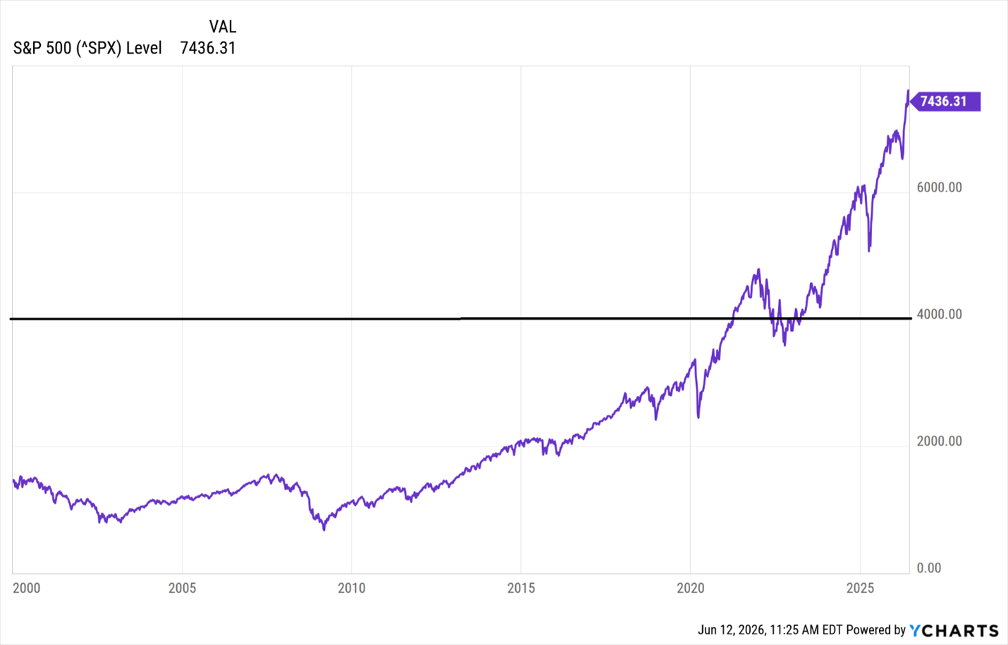
Look at what has happened since 2020 — pretty much a massive upward move from the 3,000s to north of 7,400 today.
Practically no sideways action at all, which chartists call “consolidation.” And really just a couple pullbacks that were extremely short-lived.
As I said, I’m not a technical analyst. But it seems like the last place we had any type of serious consolidation was back around the 4,000 level … right where I drew my big black line.
That also happens to be my downside target for the S&P 500.
Not just because of the picture but because of history and fundamentals, too.
Indeed, I recently asked everyone’s favorite new pundit — AI — what it would take for the S&P 500 to return to its historical average P/E ratio.
The answer:
“To reach its historical median price-to-earnings (P/E) ratio of about 16 to 18, the S&P 500 would need to fall by roughly 25% to 35% from its present levels, bringing the index down to the roughly 3,500 to 4,200 range (depending on the exact earnings period used).”
So by all means, enjoy whatever gains you’re making right now.
Just know this current euphoria won’t last forever.
This time won’t be different. Here’s what I recommend you do about it.
Best wishes,
Nilus Mattive