 |
| By Bruce Ng |
I hope you’re already familiar with my three favorite indicators. These are the tools I use to determine when I can expect the next bull market rally to start.
Over the past three weeks, I’ve broken down:
- Bitcoin’s Spot CVD, which measures buying or selling pressure on Bitcoin, the undisputed market leader
- Impulsive price action, which marks the start of a new price trend
- And the Coinbase perp premium, which shows whether the big-foot TradFi investors are loading up on crypto
If you haven’t yet read these deep dives, I encourage you to do so now. But to sum up, all three say the same thing: The bull rally isn’t quite here … but it is on its way.
That means you’ll need to keep checking in to see when they start to signal the rally is about to begin. To that end, I want to show you how to set up each in an easy-to-read manner.
This week, we’ll start with Bitcoin’s spot CVD.
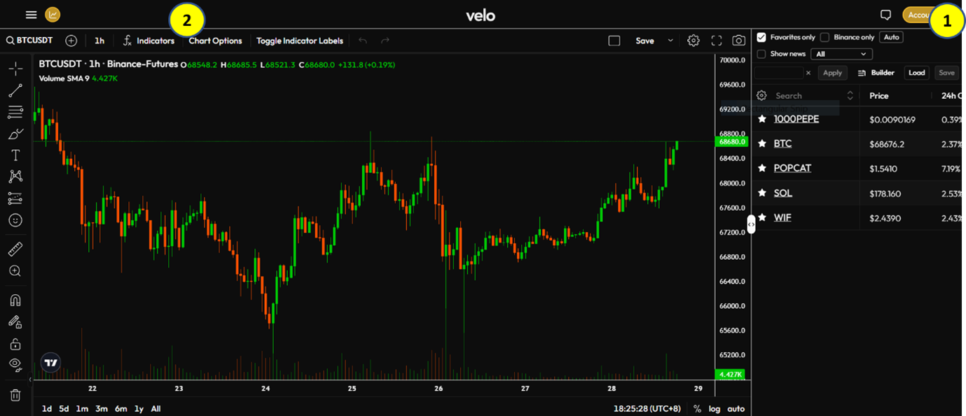
To do this, you will need access to Velo Data. Navigate to this link and you will see the following screen:
First, you need to sign up for an account. Don’t worry, it’s free. All you need is a valid email and a password that you’ll create. (It took my colleague Beth Canova just three minutes to do.)
You can set that up by clicking Account, marked by the yellow 1.
Once your account is set up, return to this page and click on the fx Indicators button on the toolbar above the chart, marked by the yellow 2.
(Note: Your screen may show fx Indicators or just fx. They are the same button.)
You will be presented with the following menu:
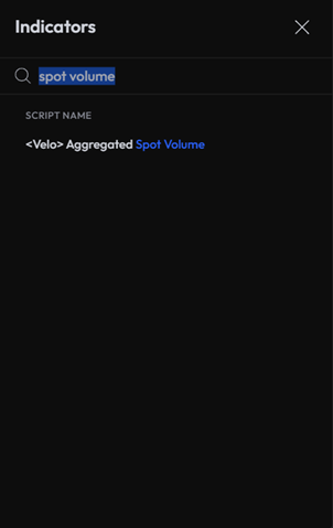
Type in spot volume in the search bar. Then click on <Velo> Aggregated Spot Volume.
A new chart should now appear below the BTC price chart:
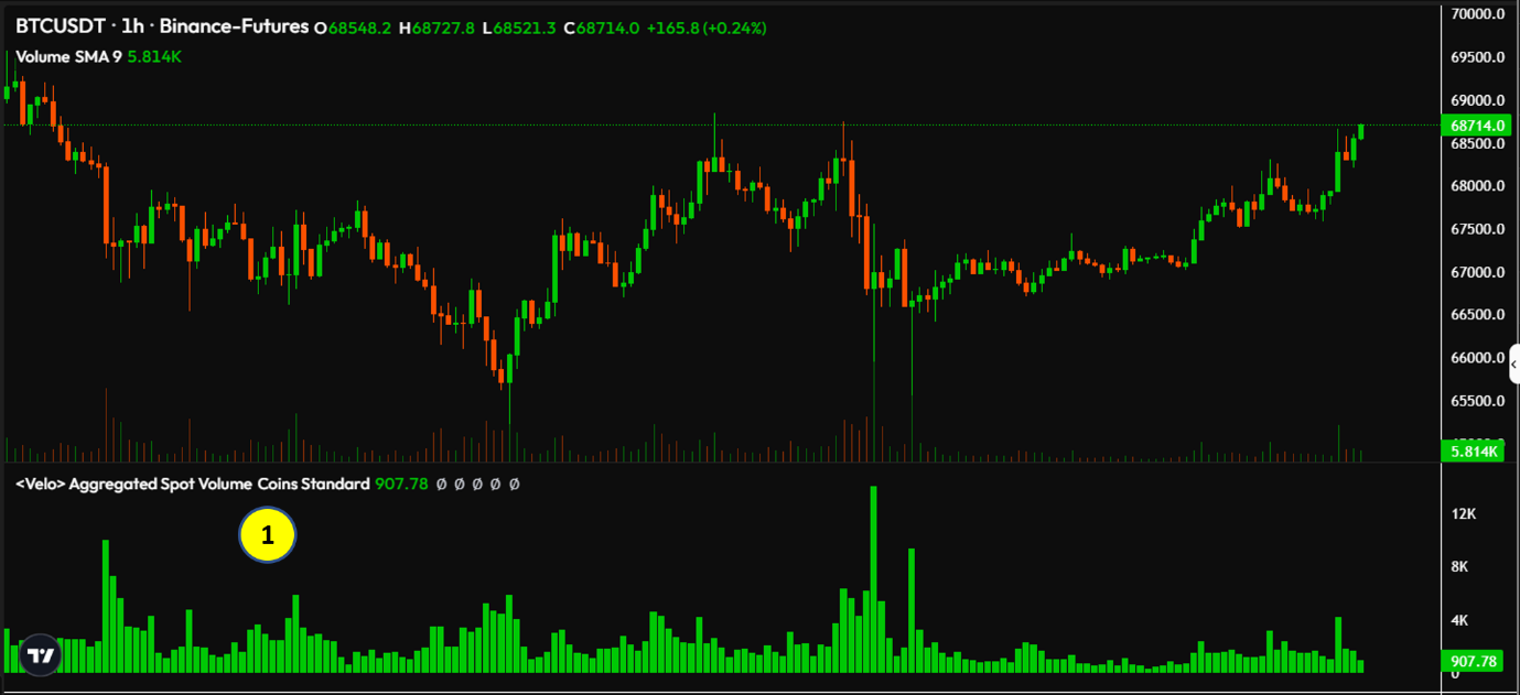
Now, double-click on the Aggregated Spot Volume Coins Standard text marked by the yellow 1 above.
You will then see the following menu. If it looks different, make sure you’re on the Inputs tab, marked by the yellow 1 below:
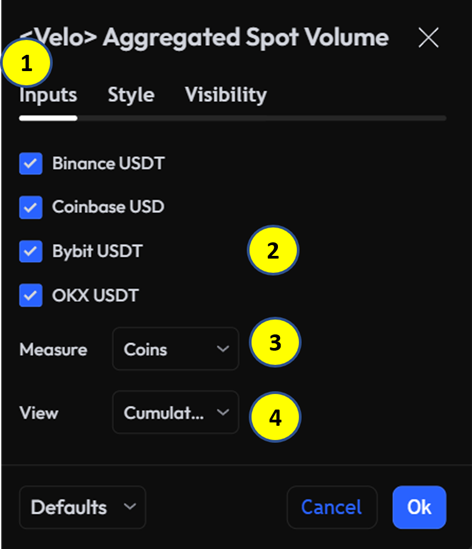
Make sure all four listed exchanges — Binance, Coinbase, Bybit and OKX — are ticked.
In the Measure field, marked by the yellow 3, use the drop-down menu to select Coins. Then, in the View field marked by the yellow 4, use the drop-down menu to select Cumulative Delta.
When your screen matches the image above, click Ok at the bottom.
And that’s it! Your chart should now look like this:
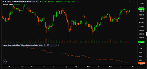
The red line at the bottom shows Bitcoin’s spot CVD.
When it goes down, sell pressure on Bitcoin is stronger.
When it goes up, buy pressure is stronger.
By adding it to your Bitcoin chart, you can see BTC’s price action and its spot CVD … all in one easy place!
To keep this configuration, simply click Save on the top left of the chart.
And remember, you can play around with different time frames to see how the spot CVD changes. That’s because smaller time frames may reveal a trend shift before it is notable in a bigger time frame.
For example, the chart above tracks Bitcoin’s daily price. Each candle — the vertical red or green lines — marks a single day. And, as you can see, the spot CVD is trending sideways.
That means sell pressure has eased … but buy pressure hasn’t begun to build.
But that changes if we zoom in to a smaller time frame.
To do that, find the 1D button at the top of your chart. Click it, then select a smaller time frame, like 1 hour.
Now, each candle on your BTC chart represents a single hour:
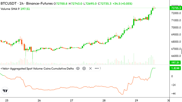
And, as you can see, BTC’s spot CVD on the smaller time frame has made an impressive wick higher. This reflects BTC’s recent strength as it finally crossed above $70,000 for the first time since early June.
This trend is too new to be seen on the longer time frame right now. But keep an eye out for when it does.
That’ll be a strong signal that the rally is about to get underway.
But, as I said, this is only one indicator I use. In my next issue, I’ll show you how to determine impulsive price action and set up the Coinbase premium indicator.
Until then,
Dr. Bruce Ng